
Introduction: Why Data Visualization Still Matters
Imagine opening a spreadsheet filled with hundreds of numbers. Rows, columns, decimals — everything looks overwhelming. You try to understand what the data is telling you, but without visualization, it is almost impossible to quickly see patterns or trends.
This is exactly why Matplotlib Data Visualization in Python is such an essential skill for anyone working with data, machine learning, or artificial intelligence.
Instead of staring at numbers, you can transform raw data into clear charts and visual insights. A simple line chart can reveal trends. A bar chart can compare categories. A scatter plot can expose relationships between variables.
Matplotlib is one of the most widely used Python libraries for creating data visualizations. It is powerful, flexible, and used by data scientists, analysts, and AI engineers across the world.
The good news?
You don’t need advanced programming skills to start.
With modern tools like AI coding assistants (Claude, ChatGPT, or GitHub Copilot), beginners can learn Python visualization faster than ever before.
In this beginner-friendly guide, you will learn Matplotlib Data Visualization in Python step-by-step using practical examples.
By the end of this tutorial, you will know how to create professional charts using real data.
Python is widely used not only for data analysis but also for automation tasks. Learn how to automate everyday workflows in our Python Automation for Beginners guide.
What You Will Learn in This Tutorial
In this Matplotlib Data Visualization in Python guide, you will learn:
- How to install and set up Matplotlib
- How Matplotlib figures and axes work
- How to create 5 essential chart types
- How to customize charts professionally
- How to visualize real datasets with Python
- How to combine multiple charts in one figure
This tutorial is designed for absolute beginners, so even if you have never created a chart using Python before, you will be able to follow along.
Why Use Matplotlib for Data Visualization in Python?
There are many visualization libraries in Python, including:
- Seaborn
- Plotly
- Bokeh
However, Matplotlib remains the foundation for most Python data visualization tools.
Here are some key reasons why beginners should learn Matplotlib Data Visualization in Python.
1. Industry Standard
Matplotlib has been used for over a decade in data science and research. Most Python visualization libraries are built on top of it.
2. Highly Flexible
You can create simple charts or extremely complex visualizations depending on your needs.
3. Works with Popular Libraries
Matplotlib integrates perfectly with:
- Pandas
- NumPy
- SciPy
- Scikit-learn
If you plan to work in machine learning or AI, learning Matplotlib Data Visualization in Python is extremely valuable.
4. Huge Community Support
Since Matplotlib is widely used, you will find thousands of tutorials, examples, and community resources online.
Most numerical datasets in Python are processed using NumPy arrays. If you want to understand numerical computing in Python, check out our guide on NumPy for AI Beginners.
Prerequisites (Don’t Worry — It’s Simple)
To follow this Matplotlib Data Visualization in Python tutorial, you only need a few basic things.
Basic Python Knowledge
You should understand basic Python concepts like:
- variables
- lists
- running Python scripts
Even beginner-level knowledge is enough.
Python Installed
Make sure Python 3.x is installed on your system.
A Code Editor
You can use:
- VS Code
- Jupyter Notebook
- Google Colab
All three work great for Matplotlib Data Visualization in Python.
Setting Up Your Python Environment
Before creating charts, we need to install Matplotlib.
The installation process is simple.
Step 1: Install Matplotlib
Open your terminal or command prompt and run:
pip install matplotlib
This command downloads and installs the Matplotlib library.
Once installed, Python will be able to use Matplotlib to generate visualizations.
Step 2: Verify Installation
Open Python and run the following code:
import matplotlib
print(matplotlib.__version__)
If Python prints the version number, the installation was successful.
Step 3: Install Jupyter Notebook (Optional)
Many beginners prefer working in Jupyter Notebook because it allows you to see charts instantly.
Install it using:
pip install notebook
Then launch it with:
jupyter notebook
This will open an interactive coding environment in your browser.
Your First Chart in Matplotlib
Now comes the exciting part: creating your first visualization.
Let’s start with a simple line chart.
Example: Basic Line Chart
import matplotlib.pyplot as pltx = [1,2,3,4,5]
y = [2,4,6,8,10]plt.plot(x,y)plt.title("Simple Line Chart")
plt.xlabel("X Values")
plt.ylabel("Y Values")plt.show()
What This Code Does
plt.plot()creates the line chartplt.title()adds a chart titleplt.xlabel()labels the x-axisplt.ylabel()labels the y-axisplt.show()displays the chart
This simple example demonstrates the power of Matplotlib Data Visualization in Python.
With only a few lines of code, we turned raw numbers into a visual chart.
For detailed configuration options and advanced features, you can explore the Matplotlib official documentation.
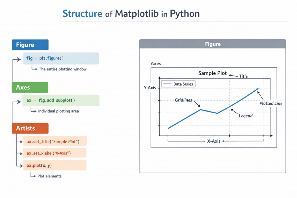
Understanding the Anatomy of a Matplotlib Figure
To use Matplotlib Data Visualization in Python effectively, it’s important to understand the structure of a chart.
Matplotlib charts have three main components.
1. Figure
The Figure is the overall canvas that holds the entire chart.
Think of it as the blank page where everything will be drawn.
2. Axes
Axes represent the actual plotting area.
They contain:
- the data
- the grid
- labels
- titles
Most charts contain one Axes, but complex visualizations can contain multiple axes.
3. Artists
Everything drawn inside a chart is called an Artist.
Examples include:
- lines
- text
- labels
- markers
- legends
These elements work together to produce a complete visualization.
Understanding this structure makes Matplotlib Data Visualization in Python much easier to control and customize.
pyplot vs Object-Oriented Interface
Matplotlib supports two main approaches for creating charts.
1. Pyplot Interface (Beginner Friendly)
This is the most common method used in beginner tutorials.
Example:
import matplotlib.pyplot as plt
plt.plot([1,2,3],[4,5,6])
plt.show()
It is simple and easy to learn.
2. Object-Oriented Approach (Advanced)
Professional data scientists often use the object-oriented style.
Example:
fig, ax = plt.subplots()ax.plot([1,2,3],[4,5,6])
ax.set_title("Example Chart")plt.show()
This method provides more control over visualizations.
However, beginners learning Matplotlib Data Visualization in Python usually start with the pyplot interface.
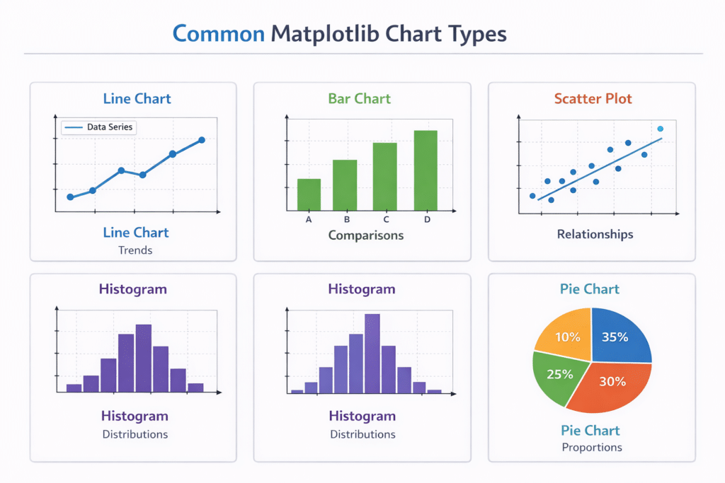
The 5 Essential Chart Types Every Beginner Should Know
Once you understand the basics, the next step is learning the most important chart types.
These five visualizations cover most beginner data analysis tasks.
They are also the most common charts used in Matplotlib Data Visualization in Python.
The five chart types are:
- Line Chart
- Bar Chart
- Scatter Plot
- Histogram
- Pie Chart
In the next section, we will explore each chart type with practical examples.
5 Essential Chart Types in Matplotlib Data Visualization in Python
When beginners start learning Matplotlib Data Visualization in Python, they often feel overwhelmed by the large number of chart options available.
The truth is that most data analysis tasks use only a few core chart types.
If you master the following five visualizations, you will be able to handle most beginner-level data visualization tasks.
These charts are:
- Line Chart
- Bar Chart
- Scatter Plot
- Histogram
- Pie Chart
Let’s explore each one step by step.
1. Line Chart (Best for Trends)
A line chart is the most common visualization used to show trends over time.
It connects data points with lines so you can easily see patterns and changes.
Common use cases include:
- website traffic over time
- stock market trends
- sales growth
- temperature changes
Line charts are widely used in Matplotlib Data Visualization in Python for time-series data.
Example: Creating a Line Chart
import matplotlib.pyplot as pltdays = [1,2,3,4,5]
sales = [100,120,150,170,200]plt.plot(days, sales)plt.title("Daily Sales Growth")
plt.xlabel("Days")
plt.ylabel("Sales")plt.show()
Explanation
plt.plot()creates the line graphdaysrepresents the x-axissalesrepresents the y-axis
The result is a simple chart showing how sales increase over time.
This type of visualization is extremely useful when analyzing business trends or machine learning metrics.
2. Bar Chart (Best for Comparisons)
A bar chart is used to compare different categories.
Instead of showing trends over time, it helps you compare values across groups.
Examples include:
- comparing product sales
- comparing student scores
- comparing website traffic sources
Bar charts are one of the most frequently used tools in Matplotlib Data Visualization in Python.
Example: Creating a Bar Chart
import matplotlib.pyplot as pltproducts = ["Laptop","Tablet","Phone","Monitor"]
sales = [50,30,70,40]plt.bar(products, sales)plt.title("Product Sales Comparison")
plt.xlabel("Products")
plt.ylabel("Units Sold")plt.show()
Explanation
plt.bar()creates the bar chart- Each bar represents a category
- The height of each bar shows the value
Bar charts are excellent for making comparisons easy to understand.
3. Scatter Plot (Best for Relationships)
A scatter plot shows the relationship between two variables.
Each point represents one observation in the dataset.
This visualization is extremely important in:
- machine learning
- statistics
- data science
Scatter plots help identify patterns such as:
- positive correlation
- negative correlation
- clusters
These insights are critical when working with Matplotlib Data Visualization in Python for data analysis.
Example: Creating a Scatter Plot
import matplotlib.pyplot as plthours_studied = [1,2,3,4,5,6,7]
exam_scores = [50,55,65,70,75,85,90]plt.scatter(hours_studied, exam_scores)plt.title("Study Time vs Exam Score")
plt.xlabel("Hours Studied")
plt.ylabel("Exam Score")plt.show()
Explanation
Each point in the scatter plot represents:
- how many hours a student studied
- the score they achieved
This visualization clearly shows that more study time leads to higher scores.
Scatter plots are extremely useful when analyzing relationships between variables.
4. Histogram (Best for Data Distribution)
A histogram shows how data is distributed across ranges.
Instead of comparing categories, it groups numerical values into bins.
Common uses include:
- analyzing exam score distribution
- understanding age distribution
- checking data spread in machine learning datasets
Histograms are frequently used in Matplotlib Data Visualization in Python during data exploration.
Example: Creating a Histogram
import matplotlib.pyplot as pltscores = [55,60,65,70,70,72,75,80,85,90,90,92]plt.hist(scores, bins=5)plt.title("Exam Score Distribution")
plt.xlabel("Score Range")
plt.ylabel("Frequency")plt.show()
Explanation
plt.hist()creates the histogrambinsdefines how many groups the data is divided into
This chart helps identify whether the data is:
- normally distributed
- skewed
- clustered
Understanding distributions is extremely important in data science and machine learning.
5. Pie Chart (Best for Proportions)
A pie chart shows how different parts contribute to a whole.
It divides data into slices representing percentages.
Examples include:
- market share of companies
- budget distribution
- website traffic sources
Although pie charts are used less frequently in advanced data science, they are still common in Matplotlib Data Visualization in Python for business reports.
Example: Creating a Pie Chart
import matplotlib.pyplot as plttraffic_sources = ["Google","Social Media","Direct","Referral"]
visitors = [50,25,15,10]plt.pie(visitors, labels=traffic_sources, autopct='%1.1f%%')plt.title("Website Traffic Sources")plt.show()
Explanation
plt.pie()creates the pie chartlabelsadds category namesautopctshows percentages
This chart clearly shows where website traffic comes from.
Customizing Charts in Matplotlib
Creating charts is only the first step.
To make your visualizations clear and professional, you need to customize them.
Customization improves readability and helps viewers understand your data faster.
In Matplotlib Data Visualization in Python, you can customize:
- colors
- gridlines
- legends
- labels
- markers
Let’s look at a simple example.
Example: Customizing a Chart
import matplotlib.pyplot as pltx = [1,2,3,4,5]
y = [2,4,6,8,10]plt.plot(x, y, color="blue", marker="o", linestyle="--")plt.title("Customized Line Chart")
plt.xlabel("X Axis")
plt.ylabel("Y Axis")plt.grid(True)plt.show()
Customization Features
This chart includes several visual improvements.
colorchanges the line colormarkeradds points to the linelinestylechanges the line stylegrid()adds background gridlines
These small changes can make Matplotlib Data Visualization in Python charts look much more professional.
Built-in Styles in Matplotlib
Matplotlib also includes pre-built styles that automatically improve the appearance of charts.
Example styles include:
ggplotseabornfivethirtyeightdark_background
Using styles can instantly make charts look better.
Example: Using a Style
import matplotlib.pyplot as pltplt.style.use('ggplot')x = [1,2,3,4]
y = [10,20,15,25]plt.plot(x,y)plt.title("Styled Chart")plt.show()
Styles are a quick way to improve the visual quality of Matplotlib Data Visualization in Python charts.
Why These 5 Charts Matter
If you master these five chart types, you will already understand most beginner-level data visualization tasks.
Together they help answer important questions like:
- How is something changing over time?
- Which category performs better?
- Are two variables related?
- How is the data distributed?
- What percentage does each category represent?
These insights are exactly why Matplotlib Data Visualization in Python is such an important skill for data scientists and AI developers.
Visualizing Real Data with Matplotlib and Pandas
So far, we have learned the fundamentals of Matplotlib Data Visualization in Python and explored the most important chart types.
However, real-world data projects rarely involve manually typed numbers. Instead, data usually comes from files such as:
- CSV files
- Excel spreadsheets
- databases
- APIs
In Python, the most common library used for handling datasets is Pandas.
Pandas works perfectly with Matplotlib, making it easy to load, clean, and visualize data.
Before creating charts, you usually need to clean and analyze your dataset. If you’re new to working with datasets, read our complete guide on Pandas for Data Analysis in Python.
Let’s walk through a simple real-world example.
Step 1: Install Pandas
If you do not already have Pandas installed, you can install it using pip.
pip install pandas
Once installed, we can import both libraries.
import pandas as pd
import matplotlib.pyplot as plt
This combination is extremely common in Matplotlib Data Visualization in Python workflows.
Pandas provides powerful tools for reading and cleaning datasets. You can learn more from the Pandas documentation.
Step 2: Load a CSV Dataset
Suppose we have a dataset called:
sales_data.csv
Example structure of the dataset:
| Month | Sales |
|---|---|
| Jan | 200 |
| Feb | 240 |
| Mar | 300 |
| Apr | 280 |
| May | 350 |
We can load this file using Pandas.
import pandas as pddata = pd.read_csv("sales_data.csv")print(data.head())This command loads the dataset and shows the first few rows.
Data exploration is a crucial step before starting Matplotlib Data Visualization in Python.
Step 3: Create a Visualization from Real Data
Now let’s convert this dataset into a line chart.
import matplotlib.pyplot as pltplt.plot(data["Month"], data["Sales"])plt.title("Monthly Sales Trend")
plt.xlabel("Month")
plt.ylabel("Sales")plt.show()
This chart immediately reveals how sales change across months.
Instead of analyzing numbers manually, visualization makes patterns obvious.
This is the real power of Matplotlib Data Visualization in Python.
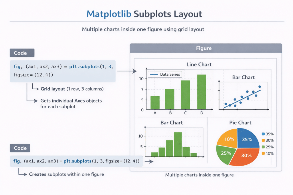
Creating a Multi-Chart Dashboard with Subplots
In real data analysis projects, one chart is rarely enough.
Often, analysts need to show multiple visualizations in a single figure.
Matplotlib allows us to do this using subplots.
Subplots create a grid of charts inside one figure.
This technique is commonly used in:
- data science reports
- machine learning dashboards
- business analytics presentations
Example: Creating Multiple Charts
import matplotlib.pyplot as pltx = [1,2,3,4,5]
y1 = [2,4,6,8,10]
y2 = [1,3,5,7,9]fig, ax = plt.subplots(1,2)ax[0].plot(x,y1)
ax[0].set_title("Line Chart")ax[1].bar(x,y2)
ax[1].set_title("Bar Chart")plt.tight_layout()plt.show()
Explanation
plt.subplots()creates multiple charts(1,2)means 1 row and 2 columnstight_layout()prevents overlapping elements
Using subplots allows developers to build data dashboards using Matplotlib Data Visualization in Python.
Example: Simple Data Dashboard
Imagine analyzing website analytics data.
You might want to visualize:
- daily visitors
- traffic sources
- engagement trends
Using Matplotlib, you could build a dashboard with:
- a line chart for visitors
- a bar chart for traffic sources
- a pie chart for traffic distribution
This combination provides a complete overview of the data.
Learning how to combine charts is an important skill in Matplotlib Data Visualization in Python.
Common Matplotlib Errors (And How to Fix Them)
Beginners often run into small issues when learning Matplotlib.
Fortunately, most problems are easy to fix.
Here are some common errors and their solutions.
Error 1: Chart Not Showing
Problem:
You run the code but no chart appears.
Solution:
Make sure you include:
plt.show()
Without this command, the chart will not display in many environments.
Error 2: ModuleNotFoundError: matplotlib
Problem:
Python cannot find the Matplotlib library.
Solution:
Install it using pip.
pip install matplotlib
Error 3: Labels Overlapping
Problem:
Axis labels or titles overlap with chart elements.
Solution:
Use:
plt.tight_layout()
This automatically adjusts spacing.
Error 4: Charts Look Too Basic
Problem:
Charts look plain and not visually appealing.
Solution:
Use built-in styles.
Example:
plt.style.use("ggplot")This dramatically improves the appearance of charts.
When to Use Matplotlib vs Other Libraries
Although Matplotlib Data Visualization in Python is powerful, there are other visualization libraries worth exploring.
Two of the most popular are:
Seaborn
Seaborn builds on top of Matplotlib and provides more visually appealing statistical plots.
It is often used for:
- correlation heatmaps
- distribution plots
- statistical visualization
Plotly
Plotly is designed for interactive visualizations.
Unlike Matplotlib, Plotly charts can include:
- hover effects
- zooming
- interactive dashboards
Many developers start with Matplotlib and later expand to these libraries.
The AI Learning Loop for Python Visualization
One major advantage beginners have today is the ability to learn faster using AI tools.
When learning Matplotlib Data Visualization in Python, you can use AI assistants to:
- generate example code
- debug errors
- explain concepts
- improve chart design
A powerful learning loop looks like this:
- Try writing the code yourself
- Run the program
- If something breaks, ask AI for help
- Understand the solution
- Repeat with new experiments
This cycle helps beginners master Python visualization much faster.
Practice Datasets for Beginners
The best way to learn Matplotlib Data Visualization in Python is through practice.
Here are some beginner-friendly datasets you can explore:
- student exam scores
- sales performance data
- website traffic statistics
- weather temperature records
- movie ratings datasets
These datasets allow you to experiment with different chart types and visualization techniques.
Conclusion
Learning Matplotlib Data Visualization in Python is an important step for anyone interested in:
- data science
- machine learning
- artificial intelligence
- data analysis
In this beginner tutorial, you learned:
- how to install Matplotlib
- how Matplotlib figures and axes work
- the five most important chart types
- how to customize visualizations
- how to visualize real datasets
- how to build multi-chart dashboards
With just a few lines of Python code, you can transform raw numbers into meaningful visual insights.
The next step is simple: practice regularly.
Try visualizing different datasets, experiment with chart styles, and explore more advanced visualization techniques.
As your Python skills grow, you will find that Matplotlib Data Visualization in Python becomes an essential tool in your programming toolkit.
If your goal is to use Python for machine learning and artificial intelligence, you should also read our Python for AI Complete Beginner Guide.
Data visualization is often used before natural language processing tasks. If you’re interested in text analysis, check out our tutorial on Text Preprocessing in Python for NLP.
Frequently Asked Questions (FAQ)
Is Matplotlib good for beginners?
Yes. Matplotlib is one of the best libraries for beginners learning data visualization in Python. It is widely used and well documented.
Is Matplotlib used in machine learning?
Yes. Matplotlib is commonly used to visualize machine learning results such as training accuracy, loss curves, and model performance.
Should I learn Matplotlib before Seaborn?
Yes. Seaborn is built on top of Matplotlib, so understanding Matplotlib first makes learning Seaborn much easier.
Can Matplotlib handle large datasets?
Yes, but for extremely large datasets specialized visualization tools may perform better.

